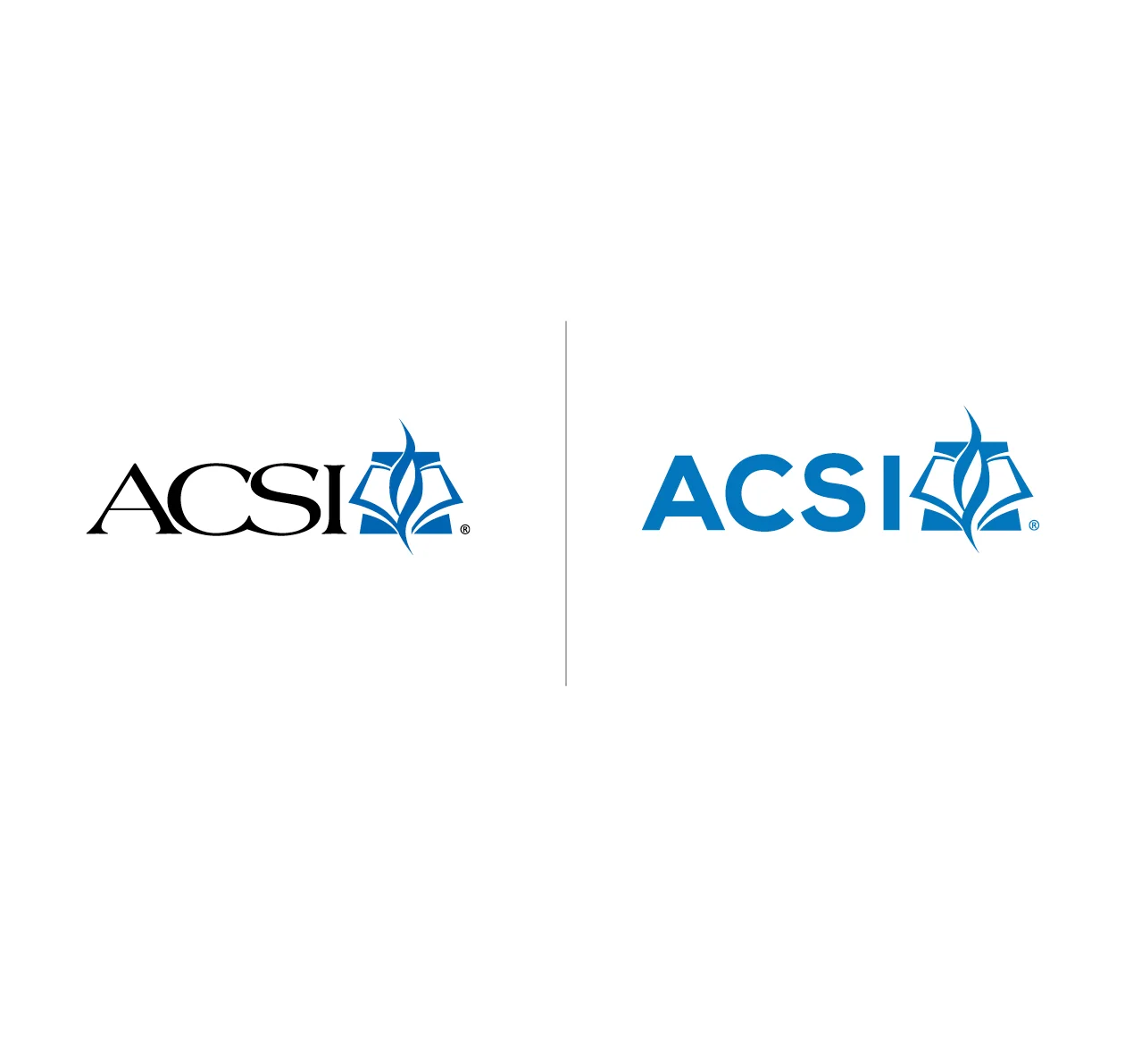
Fresh visuals, bold messaging, and a strategic, simplified brand architecture gave ACSI the right tools to communicate clearly and creatively.
With the strategy established, our creative team began work on the visuals and messaging.
The parent logo was refreshed with a clean, contemporary typeface and brighter color tone while maintaining the existing mark.
The overall color palette showcases the proven expertise brand feel. The color blue communicates a base of trust, professionalism, and confidence. Selective use of bright orange balances the brand and signifies both innovation and a fresh season at ACSI.
We also shifted their photography style away from a cliched, brightly-colored “elementary school” feel to images that reflect a more well-rounded view of the education profession. They use strong contrast and angles, and relate to educators as professionals and peers.
The tagline, Stronger Together, comes directly from the brand’s point of entry. It speaks to ACSI’s mission of connecting educators with expertise and best practices, with each other, and most importantly, with Christ. This makes the ACSI community stronger together.
Inspired by the tagline, the messaging speaks directly to the needs of ACSI’s audiences with words that are bold and direct, tempered with a “we get you” voice.


